前回のAngular2入門 Component編 その1 では、
Componentの基本的な使い方について紹介いたしました。
今回は以下の様な2つのComponentを作成し、お互いにデータのやり取りをする方法を紹介致します。
- 今回作成するサンプルについて
- app Component と custom-button Componentの2つを作成する
- app Component は テキスト入力欄 を持っている
- テキスト入力欄の値と、custom-button Component内のボタンのラベルは同じものを表示する
- custom-button をクリックすると、Consoleに今表示しているボタンのラベルを出力する
- custom-button をクリックすると、親Component(=app)にボタンが押されたことを通知する
- app Componentは、custom-button からのクリックイベントを受け取り、Consoleにメッセージを表示する
新規Componentの作り方
今回作成するサンプルの新規プロジェクトを作りましょう。
以下のコマンドを実行し、プロジェクトを作ります。
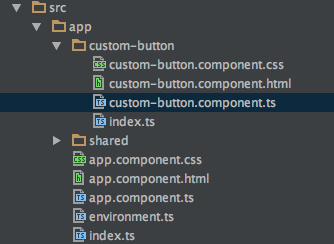
ng new component-example今回はCustomButton Componentも作成したいため、以下コマンドを実行しComponentを追加します。
ng g component custom-button以下のようなファイルが出来上がります。
CustomButton Componentを利用する
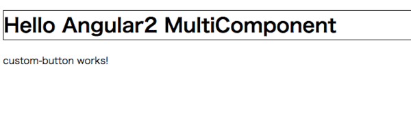
まずは、以下の様なほとんど中身の無いCustomButton Componentを作成してみます。
// custom-button.component.ts
import {Component} from '@angular/core';

@Component({
  moduleId: module.id,
  selector: 'custom-button',
  template: `
  <div class="testStyle">
    custom-button works!
  </div>
  `
})
export class CustomButtonComponent {
}
単純に「custom-button works!」と表示するだけのComponentができました。
selector: ‘custom-button’ と 指定しているため、
テンプレート内では <custom-button></custom-button> として、このComponentが利用できます。
このコンポーネントをAppComponent内で利用してみましょう。
// app.component.ts
import {Component} from '@angular/core';
import {CustomButtonComponent} from "./custom-button/custom-button.component";

@Component({
  moduleId: module.id,
  selector: 'app-root',
  template: `
  <h1 class="testStyle">
  Hello Angular2 MultiComponent
  </h1>

  <custom-button>
  </custom-button>
  `,
  styles: [`
  .testStyle {
    border: 1px solid black;
  }
  `],
  directives: [CustomButtonComponent]
})
export class AppComponent {
}
作成した custom-button Componentを利用するためには、
AppComponent には directives: [CustomButtonComponent] と指定する必要があります。
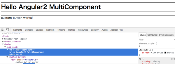
作成したコンポーネントは以下の様に表示されます。
Hello Shadow Dom and View Encapsulation
AppComponent内で
// app.component.ts
styles: [`
.testStyle {
  border: 1px solid black;
}
`]
と、cssの定義を行いました。 class="testStyle" とすることで、指定したタグをBorderで囲います。
ここで指定した .testStyleクラスは、他のコンポーネントに影響を及ぼしません。
CustomButtonComponent 内で
// custom-button.component.ts
template: `
<div class="testStyle">
  custom-button works!
</div>
`
としてtestStyleを利用していますが、Borderで囲われていないことに注目してください。
Angular2では自コンポーネント内だけで利用でき、他のコンポーネントに影響を及ぼさないスタイルを定義することができます。
CSSの定義を見ると、以下のようにしてカプセル化を実現していることがわかります。
Angular2はデフォルトでスタイルのカプセル化の挙動を取りますが、
ViewEncapsulation Noneを指定することで、この挙動を変更することができます。
以下のようにAppComponentを修正してみます。
// app.component.ts 一部抜粋
@Component({
moduleId: module.id,
selector: 'app-root',
template: `
<h1 class="testStyle">
Hello Angular2 MultiComponent
</h1>
<custom-button>
</custom-button>
`,
styles: [`
.testStyle {
border: 1px solid black;
}
`],
directives: [CustomButtonComponent],
encapsulation: ViewEncapsulation.None // <-- ここを追加
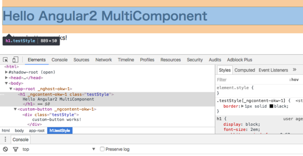
})encapsulation: ViewEncapsulation.None という記述を追加しました。
この指定をするとViewのカプセル化を行いません。
以下のように、AppComponent内のスタイルが別のコンポーネントに影響を及ぼします。
Input
AppComponentとCustomButtonComponent間でデータのやり取りをしてみましょう。
まずは、AppComponent から CustomButtonComponent にデータを受け渡してみます。
AppComponent テンプレート内にテキスト入力欄を用意し、そこに入力された値を
CustomButton Componentに送ります。
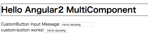
AppComponentは以下のとおりです。
// app.component.ts
import {Component, ViewEncapsulation} from '@angular/core';
import {CustomButtonComponent} from "./custom-button/custom-button.component";

@Component({
  moduleId: module.id,
  selector: 'app-root',
  template: `
  <h1 class="testStyle">
  Hello Angular2 MultiComponent
  </h1>

  CustomButton Input Message: <input type="text" [(ngModel)]="customButtonInputMessage" />

  <!-- [buttonMessage] の [] は inputの意味です -->
  <custom-button [buttonMessage]="customButtonInputMessage">
  </custom-button>
  `,
  styles: [`
  .testStyle {
    border: 1px solid black;
  }
  `],
  directives: [CustomButtonComponent]
})
export class AppComponent {
  public customButtonInputMessage: string;

  ngOnInit() {
    this.customButtonInputMessage = "Hello!";
  }
}
テキスト入力欄(inputタグ) に登場する [(ngModel)]="変数名" は、いわゆるTwo-way data bindingと呼ばれているもので、
入力されたデータと customButtonInputMessage 変数をひも付けています。
custom-buttonに [buttonMessage]="変数名" という指定をしていますが、
この記述を行うことで、App Component から CustomButton Componentに値を送ることができます。[CustomButton Componentで受け取りたい変数名]="Componentに渡したい変数名" として利用します。
CustomButtonComponentでは、以下のようにinputsオプションを利用することで、AppComponentからの値を受けとれます。
// custom-button.component.ts
import {Component} from '@angular/core';

@Component({
  moduleId: module.id,
  selector: 'custom-button',

  // 以下記述を追加 親コンポーネントからは
  // <custom-button [buttonMessage]='変数'></custom-button> として利用

  inputs: ['buttonMessage'],

  template: `
  <div class="testStyle">
    custom-button works!

    <button>
      {{ buttonMessage }}
    </button>
  </div>
  `
})
export class CustomButtonComponent {
  buttonMessage: string;
}
Output
今度は逆に、CustomButton Componentから親コンポーネントであるAppComponentにイベントを送ってみます。
以下の様なコードを書くことで、
CustomButton Component内のボタンをクリックしたら、AppComponent に 値を送信できます。
// custom-button.component.ts
import {Component, EventEmitter} from '@angular/core';

@Component({
  moduleId: module.id,
  selector: 'custom-button',
  inputs: ['buttonMessage'],
  outputs: ['buttonEventEmitter'], // outputs を追加
  template: `
  <div class="testStyle">
    custom-button works!

    <!-- (click) でボタンクリックイベントを拾える () はOutputの意味 -->
    <button (click)="emitButtonMessage()">
      {{ buttonMessage }}
    </button>
  </div>
  `
})
export class CustomButtonComponent {
  buttonMessage: string;
  buttonEventEmitter : EventEmitter<string>;

  constructor() {
    this.buttonEventEmitter = new EventEmitter();
  }

  public emitButtonMessage() {
    console.log("show button message: " + this.buttonMessage);
    this.buttonEventEmitter.emit(this.buttonMessage);
  }
}
Component に outputs オプションを指定することで、CustomButton Componentから
親コンポーネントに向けてイベントを送ることができます。
親Component側では、
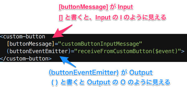
<custom-button (buttonEventEmitter)='イベント受け取った後の動作'></custom-button>
として利用できます。() は Outputの意味です。
Buttonのボタンクリックは (click) にて拾えます。
ボタンクリック後、emitButtonMessage関数を呼び出していますが、この中でthis.buttonEventEmitter.emit(送信したいオブジェクト) とすることで、
イベントの送出が可能です。
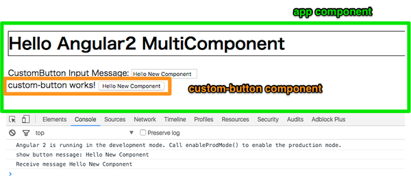
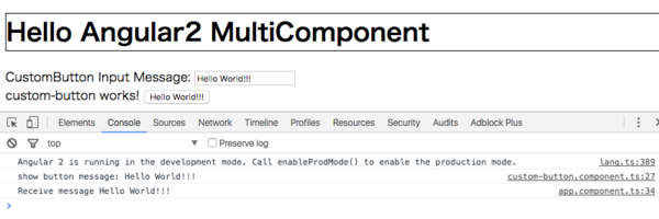
AppComponent側は、以下のようにしてイベントを受け取ります。
import {Component, ViewEncapsulation} from '@angular/core';
import {CustomButtonComponent} from "./custom-button/custom-button.component";

@Component({
  moduleId: module.id,
  selector: 'app-root',
  template: `
  <h1 class="testStyle">
  Hello Angular2 MultiComponent
  </h1>

  CustomButton Input Message: <input type="text" [(ngModel)]="customButtonInputMessage" />

  <!-- (buttonEventEmitter) として Outputを受け取れる -->
  <!-- 引数 は $event として受け取りが可能 -->
  <custom-button
    [buttonMessage]="customButtonInputMessage"
    (buttonEventEmitter)="receiveFromCustomButton($event)">
  </custom-button>
  `,
  styles: [`
  .testStyle {
    border: 1px solid black;
  }
  `],
  directives: [CustomButtonComponent]
})
export class AppComponent {
  public customButtonInputMessage: string;

  ngOnInit() {
    this.customButtonInputMessage = "Hello!";
  }

  public receiveFromCustomButton(message) {
    console.log("Receive message " + message);
  }
}
これらのコンポーネントは以下のような動きをします。
まとめ
今回は Component から別Componentを利用する方法と、Viewのカプセル化、
及びInput / Outputについて学びました。
Input は []、Outputは () です。
記号でInput/Outputを表現しているため、どっちがInputでどっちがOutputだったか時折悩むのですが、
以下の様な覚え方をすると、忘れなくなります。
次回は Routing の使い方について説明いたします。

#人気の記事
#タグ